Tools / Analysis
ElevenLabs Brand Kit: keeping a brand’s character from frame to frame
Three people make one campaign. The colours match; the images feel like three different brands. ElevenLabs Brand Kit raises a useful production question: which decisions must travel with every brief?



Imagine three people preparing one campaign. One makes the product image, another builds the setting, a third prepares the film. Everyone has the correct burgundy and a good reference board. At the review, the product feels clinical, the room nostalgic and the film glossy. The colours agree. The direction has split.
ElevenLabs Brand Kit is worth examining through that ordinary production problem. A campaign needs decisions that another person can understand and repeat, while still having room to compose a different shot. This is an analysis of the announced tool and a proposed evaluation, not a report of our own test.
What travels with the prompt
ElevenLabs says Brand Kit stores colours, fonts, logos, references and usage rules. Teams can tag a shared or client-specific kit with @ in Image & Video, Flows and the ElevenCreative agent. Availability is announced; voice and sound are planned.
Publication is dated 9 October, with an 8 October update shown on the same page. Neither date establishes first access. Logo fidelity, plan eligibility and generation limits are not established by this announcement.
For a director, I would frame the opportunity as a clearer handoff. Instead of hoping a colleague interprets ‘quiet luxury’ the same way, give them decisions they can inspect. The useful question is whether the next image still belongs beside the approved one.
Sources: Renee Zhang / ElevenLabs [1] · ElevenLabs [2]
Brand Kit in the official announcement
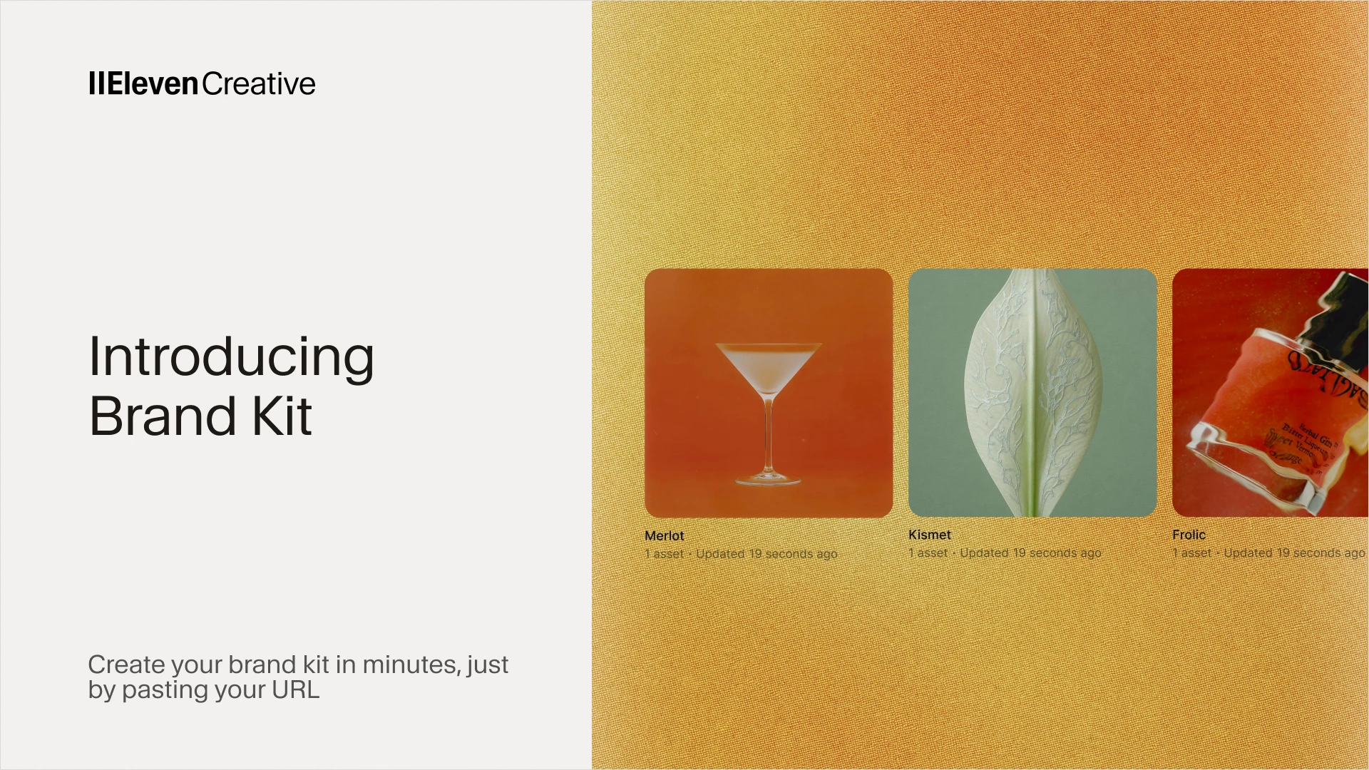
Publisher’s promotional banner, not our test output. The original YouTube demo was private when checked on 10 October; no video player is embedded.
Write the decisions behind the look
For our imaginary campaign, I would begin with one approved frame and annotate its relationships. Light enters from camera left, with a soft transition into shadow. The cylinder stays matte; the ring catches a narrow highlight. The background separates from the object without a bright halo. These are instructions an art director can discuss.
Then define camera distance, the amount of empty space and the permitted stylisation. A close product view may exaggerate texture; a wider frame must preserve its proportions. Say which details are fixed and which may vary. If every composition is locked, the campaign risks becoming a repeated packshot with different backgrounds.
A test for one small campaign
Here is the test I would run. Invent a small fragrance brand with a simple cylindrical bottle, a short label and a restrained wine-coloured world. Prepare an approved reference, the exact label artwork and a page of visual decisions. Keep the product intentionally simple so a changed silhouette cannot hide inside decorative detail.
Request a product still, an environmental image and a short scene with modest camera movement. Have separate collaborators prepare the briefs. Keep the source assets, model choices, prompts and every result, including rejected attempts. Otherwise a beautiful selection can conceal how much repair the sequence required.
Repeat the same briefs without the kit, using the same supplied assets and settings wherever possible. This comparison would help separate the kit’s contribution from a strong reference image or a carefully written prompt. It would remain a small production exercise, with too few examples to support a general success rate.
Review the cut, then the vertical frame
Review the outputs together. Does the bottle keep its shape and marking? Does the apparent direction of light survive the cut? Does the material remain recognisable when the camera moves? A matching background colour cannot compensate for a cap that changes diameter or a label that becomes unreadable. Watch the sequence once without sound, too. Music should not be doing all the work of making unrelated images feel connected.
Then make a vertical version and inspect it at phone size. Recompose around the product rather than relying on a centre crop. Check whether the space intended for a headline still exists, whether reflections crowd the label and whether the frame retains the same visual weight. Record repairs as part of the result.
Give the next person a decision they can use
The standard I would set is simple: fewer unexplained differences between collaborators, with enough freedom to make each shot work. Keep a dated approved frame beside the written rules and assign someone to resolve contradictions. Saved guidance becomes useful when the team can point to a specific decision. Every generated result still needs someone to look at it.
SOURCES & METHOD
The record behind the article
Sources checked 10 October 2026. Product capabilities are attributed to ElevenLabs; the campaign, test plan and evaluation criteria are editorial proposals. No hands-on test or complete demo playback was performed. The cover is a conceptual editorial illustration, not a demonstration of Brand Kit.
- Introducing Brand Kit ↗Renee Zhang / ElevenLabs · 9 October 2026; page also shows an 8 October update
- ElevenLabs product updates ↗ElevenLabs · Checked 10 October 2026